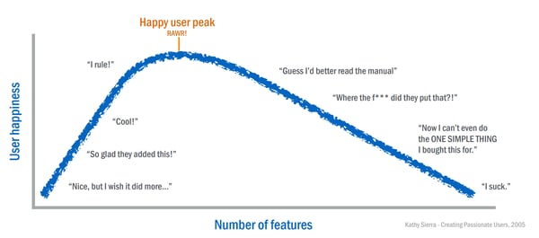
Imagine, you are working with an enthusiastic team to make your product skyrocket. Each iteration you are adding a few features and information to complete your product. But suddenly, you notice a drop in conversion rates. Your customers are raising a bunch of support questions, are not converting anymore and give you poor usability grades. You are left confused. Although you gave your customers more tools and information to fulfill their tasks, their performance declines. Indeed, you are diagnosed with featuritis.
This article first appeared on Medium.
Featuritis?
Wikipedia learns us that featuritis is about the ongoing expansion or addition of new features in a product, especially in computer software and consumer and business electronics. These extra features go beyond the basic function of the product and can result in software bloat and over-complication, rather than simple design.
Digging a little deeper in featuritis, learns us that it’s about an excess of choices. When exposed to featuritis, users experience decision fatigue, feel dissatisfied, or even worse, abandon your product. Two main reasons are driving this behavior. First, people can feel mentally exhausted when they have to compare too many options. On top of that, once people have decided, they are often left with a feeling that they could have missed something important.

The effect of the addition of features on the user hapiness (source: Creating Passionate Users, Kathy Sierra).
Research shows that, when encountering a lot of features, the time on task and the task completion rate suffers. This means that people are less successful in finding the relevant information. Additionally, they need more time, and thus effort, to find the information or feature they are looking for. These two findings relate to a decrease in findability.
Findability
Findability is impacted by the visual weight of an element and the visual hierarchy of a product. Each element of your product has a visual weight. This visual weight is defined by a set of characteristics , including size, color, position, …, and depends on the direct environment of the element. Thus, the visual weight of an element on a crowded page will be lower than the visual weight of the same element on a balanced page. The use of visual weight in a proper way, leads to a good visual hierarchy. Such a visual hierarchy leads the eyes from the most important element to the second most important one and so on…
Long story short, the more functionalities or information, the harder a visual hierarchy can be established and the more difficult a consumer will find the relevant information. In other words, as the number of choices increases, so does the effort required to collect information and make good decisions. On a page, all information or functionalities are competing for the users’ attention, adding information or functionalities only leads to more competition, and more distraction from main element. Some of the leading companies had a similar insight and decreased the amount of functionality over time to improve the usability of their product.
 The evolution of the google homepage (source: google.com)
The perfect number of choices
The proper level of choices depends on a set of parameters: the user’s needs, expertise, mental capabilities and the context. Experienced users, will be able to handle more choices without feeling dissatisfied. Also note that, your users mental capabilities remain constant. As a consequence, users choose the path of least effort. So, users will take shortcuts and may appear lazy, but they are protecting themselves from information overload and fatigue.

The best way to avoid featuritis, is getting to know your user’s needs, expertise, mental capabilities and the context! Assess when, where and how your users use your product. Find out what they expect from your product (and what not). Investigate what they find important (and what not)! To collect this information, a lot of useful research techniques are available. Successful research is guaranteed by a combination of qualitative and quantitative research techniques. This approach will lead to insights in the what, the how & the why.
“Everything should be made as simple as possible,but not simpler”
— A. Einstein
After analysis and consolidation of the results, share the learnings to all stakeholders involved. Communication of your results will be more easy if you make them visual. Personas, journey maps or empathy maps,… are great tools for that. Now, all stakeholders are aware of what your users are looking for, what is important to them and what isn’t; you can align your product on their needs and priorities. So, focus only on the functionality or information which really deliver added value for your primary persona(s). This implies that you have to disappoint business stakeholders who request extra functionality or information which has not the highest relevance for your consumer.
What are your thoughts? What are you doing to keep your users happy? Which features do you detest? Please let us know in the comments.
I hope you enjoyed it! Thank you for reading!


