This post was written by Oliver Belmans & Bram Vanschoenwinkel
A previous series of blog posts on Marketing Analytics offered an extensive overview of the available analytical techniques for marketing and their added value. Some examples of these techniques included market basket analysis, customer segmentation and churn prediction. A conclusion reached in these blog posts was that data analytics are the ideal extension to traditional marketing: based on data, we gain insights into (potential) customers and their behaviour, so that we can target them in an even more personalised manner.
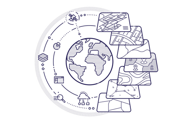
The first of a two-part blog post zooms in on an important category of marketing analytics: Geospatial analytics or Geographic analysis. What can geographic analysis signify for your business? What is the added value of using this analysis? In a second blog post, we will explain the more technical aspects, show you how you can start up this analysis with the help of the open-source software R (the R Project for Statistical Computing) and provide a complete step-by-step plan of our own workflow.
Let’s start this discussion by eliminating some of the ingrained prejudices against analytics. Afterwards, we will discuss, based on a few concrete examples, our experience with geospatial analytics and the value we have created together with our customer.

What can geographic analysis signify for your business? What is the added value of using this analysis?
Company data are often - for performance-related reasons - stored in a classic table format and also - perhaps too often - reported in that format. This makes it difficult to interpret these business data. The first step in geographic analysis is to create a simple geographic visualisation, which makes it easier and quicker to understand and apply certain insights or trends. Starting with a traditional table format, the example below displays (fictitious) points-of-sales data, where we have first expanded these data with coordinates obtained via open API-services. This allows us to visualise the data on a geographic map. As a result, we can focus very explicitly on the ‘where’ of the data and gain numerous new insights: Where are my points of sale located? Can I identify certain clusters around cities or municipalities? Which areas are more or less covered by my points-of-sales?
from the traditional table format:

to geographic visualisation (blue heat map = clusters of customers and individual customers):
These geographic visualisations can contain multiple layers of data, so that the information can be visualised in different ways: e.g. in the above example, there is a layer with the individual points of sale and a heat map layer to visualise the points-of-sales data density.
Furthermore, with open data sources, such as Google or OpenStreetMap, you can add extra location-specific context and create new insights which were not possible earlier. In the example below, we examine which points-of-sales are located in a trendy neighbourhood. This is a real use case from a recent project. Identifying these “Hipster Hotspots” assists the process for launching a new product that is specifically aimed at the “hipsters” target group. The result of this geographic analysis enables the business to target a limited number of points-of-sales and save a considerable amount of cost and effort by carrying out a more efficient marketing campaign.
(Blue area = Cluster of all points of sale / yellow area = selection of sales points based on hipster criteria)
We have applied a similar method in another project within the utilities sector. In that project, we collected the location-specific characteristics of the utilities company’s customers via open data from the Belgian government in order to develop cross-selling and up-selling models, so that products, services and promotions can be better tailored to the profile, and therefore also, to the needs of the customer.
To summarise, geographic analysis is a method of applying analytics techniques to data with a locational or geographic aspect. This ultimately leads to the creation of new knowledge and insights. Geographic analysis can be carried out very easily via a simple visualisation, through more complex geographic analyses and by enriching the data with additional geographic information that is freely offered as open data. Examples of open data providers are the Belgian government, Google or OpenStreetMap.
What do you need?
Let’s start by getting rid of some misconceptions. This kind of data analytics is NOT exclusively reserved for the big players. This analytics domain does not require big data and hence is not solely limited to international ‘mastodons’ which more often have large amounts of data, but is also equally suitable and opportune for small, local organisations.
A second misconception is about not having the right data available. However, whether it concerns sales, production or logistics data, most company data do in fact include a locational aspect, which is something that is indispensable for geospatial analytics.
A final, more general misconception about analytics is that the tools are often considered to be inadequate or too expensive. We do not use any complex, commercial tools, but instead we use open-source software, such as R or Python, for the analyses as well as open-source JavaScript libraries, such as Leaflet, for the visualisations
Combined with a pragmatic approach, all of this is within everyone’s reach. As with any analytics project, a rapid prototyping and ‘think big, act small’ approach is the key to success. Typically, we work incrementally and iteratively, ensuring that we have as many opportunities as possible to get feedback from the business. But, most importantly, we work in a manner that is specifically tailored to the business. This approach and an agile development process are often necessary to convince important stakeholders of the opportunities they will gain by working further with the data.

Analytics is an incremental and iterative process to get useful insights from data. Enriching your own internal data with external data sources can mean enormous added value.
From Gut feeling to Data
In the above-mentioned example of locating Hipster Hotspots, we have used open data from Google and OpenStreetMaps to enrich the points-of-sales data and used R to perform the analysis. Our approach in this use case shows that it is extremely valuable to use open data and combine this with your own data. Via public Google API’s or OpenStreetMaps APIs, you can identify an enormous amount of geographic context: e.g. how many restaurants are there in the area? Or are there any restaurants at all? What is their average distance to schools or universities? How many competitors are present within a distance of 1, 2 or 10 km?
The analysis performed in this use case is a simple and efficient example: how many coffee bars, barber shops or restaurants are there in a radius of 250 metres? The drafting of this definition, which exactly determines a hip hotspot, is a very important part of the process. We will concretize this together with business and translate it into data. Here too, a visualization can help to make the definition of hip hotspots easier to understand. In our visualisation, we show two points-of-sales, each with a different colour, with a higher score assigned to the red circle because there are more barber shops, restaurants and coffee bars in the area.
the red zone around a sales point is more interesting than the yellow zone because more barber shops, certain restaurants and coffee bars are located nearby
The results of this analysis enable the customer to conduct an efficient data-driven marketing campaign, rather than just follow its intuition or base itself only on sales figures.
Building personas
The second example from the utilities sector is a similar problem of launching and targeted offering of new products. The selection criteria here are different from the previous case. Not the number of restaurants or coffee bars, but the type of neighbourhood in terms of median income or education are interesting to know. Even more important is data about the age of the houses and the presence of mainly rented houses to build the personas. Once again we determine the selection criteria together with the business. The data is extracted from other sources than in the previous case, in this case specifically the census data of the Belgian government. Based on customer address data, we can add this extra demographic and socio-economic context per neighbourhood (statistical sector). The (fictional) example below shows a few characteristics that are available as open data, such as the percentage of working inhabitants, higher-educated inhabitants, rented houses or the median income per neighbourhood.
Finally, we have used these new customer profiles in machine learning models during a subsequent phase to implement effective and accurate cross-selling and up-selling algorithms. This enables our customer to offer a specific assortment of (new) products and services specifically targeted at similar profiles.
Getting started
After reading about these examples, do you feel the urge to get started with your own data? If so, here are some best practices to keep in mind: As always, start simple and look primarily for interesting business data which already include locational aspects. In addition, ask yourself as many value-driven questions as possible regarding the where of your data. First, try to get started with basic visualisations before developing a more complex dashboard.
This is just the tip of the iceberg. How can you start using Open Data? In the next blog post, we will delve deeper into tooling and provide a complete technical step-by-step plan for you to get started with data. We will show you how to develop personas yourself with the open source software R (The R Project for Statistical Computing). So keep an eye on the blog or subscribe to stay informed about new analytics posts.