UX CIAM
Security & UX: striking the right balance
A challenge faced by many organisations increasing their digital footprint: ensuring robust...
Read More

User experience is hot. Most companies do not have to be convinced anymore about the importance of user experience. But if you talk about users, which users are you talking about?
When designing, we make things that we think will offer a good experience, which hopefully means it will do so for people like us. But what about people that are not like you? By only considering our own point of view, we exclude a large part of the target audience. The introduction of personas can help to empathize with different points of view. But have you ever included a persona of someone with a disability or an impairment?
In 2018 Statbel released an article that states that 9% of the 15 to 64 year olds in Belgium have a disability that limits them in their daily activities. This result only covers permanent disabilities, but the spectrum is much wider than this.
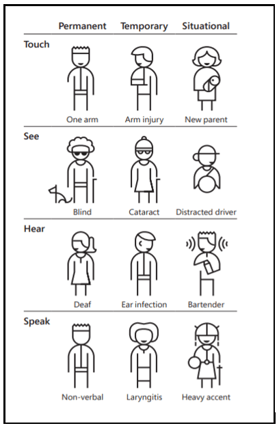
Next to permanent disabilities, you also have temporary or situational disabilities. For example, somebody can only have one arm (permanent), have an arm injury (temporary) or can be a new parent with a newborn on their arm (situational).
All of these cases will change the way people interact with your product. Impairments are of course not only physical, but can also be visual, auditory, cognitive, speech-related... A nice visualization can be found on the site of Microsoft Inclusive Design.
User experience is important to make sure people continue to use your product. Since a large part of those people will have a permanent, temporary or situational impairment at some point, accessibility is a fundamental part of usability. So, if usability is important, accessibility is as well.
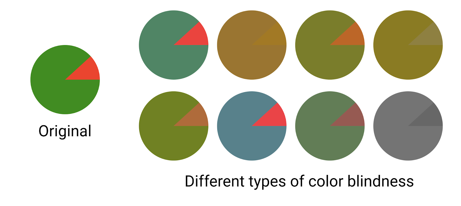
One of the easiest examples of a permanent impairment to understand is color blindness. When representing data in a graph, the use of colors should be chosen so people with color blindness can also clearly see the differences. If not, your graph is completely useless to that user. Choosing your colors wisely (which is not always that easy), is one small thing you can do to make sure you do not lose that user.
But there are a lot of other things that are important to consider next to color use. Every app user knows that when you use an app while walking, it can be very hard to hit the correct spot to execute an action. Even worse if it is the most important action of the application and it is at the top of your screen, where your thumb can’t reach it. So having touch targets that are large enough (minimum 48px) and within reach of your left or right thumb will also increase the accessibility. As a bonus, this will also help people with tremors and bigger fingers.
So of course, different impairments lead to different needs. The UK Home Office Digital made accessibility posters with some good guidelines as a starting point. These state some do’s and don’ts for several types of impairments. Some of these are very easy to take into account in the entire design process of your product, but will make sure your product is more accessible and therefore increase the user experience.
Luckily there are also some tools that can help you. In design tools such as Figma you have several plugins that can check the accessibility of your design. To choose a better combination of background and text colors, the Applicable Colors can be used. And if you are wondering how accessible your application or website is, you can always use tools like Lighthouse to find out. These are just a couple examples of many tools that are available for free, so why not use them.
We now mostly talked about why you should care about accessibility and what you can do in your design to increase it. But caring about accessibility is not only the job of the designer or functional analyst, it is the job of everyone.
In our next blogpost we will give some tips and tricks for front-end developers to make your application screen reader friendly, which is essential for people with a visual impairment.
Let us know what we can do for you? We are ready to listen to ensure you stay ahead of change!


Let us know what we can do for you? We are ready to listen to ensure you stay ahead of change!
Let us know what we can do for you? We are ready to listen to ensure you stay ahead of change!


-1.png?width=300&name=TEMPLATE%20feature%20image%20voor%20HubSpot%20pages%20+%20Spotlight%20first%20blog%20post%20(6)-1.png)
-1.png?width=300&name=TEMPLATE%20feature%20image%20voor%20HubSpot%20pages%20+%20Spotlight%20first%20blog%20post%20(7)-1.png)
Let us know what we can do for you? We are ready to listen to ensure you stay ahead of change!

Kevin Stobbelaar
Director Data & AI