

A few weeks ago I participated in a hackathon organised by AE. We began friday morning and by saturday night we had to present our idea and demo our product. Our team consisted of four awesome technical wizards: @thomaux, @glenndejaeger, @piether and Alex Wauters. As you might guess, I was the analyst.

Our product was a responsive HTML5 website. As this was the first time I designed for a mobile device, I obviously learned a lot. One big lesson I learned is to start by designing the user experience for the smartphone as this device poses the biggest challenges.
Screen size
First of all smartphones have the smallest screens. The information you can show is very limited, so you need to think about what is essential for the user during the task he is performing.
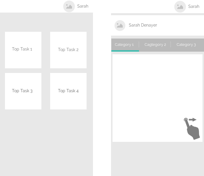
The homepage for example consisted of four top tasks and a link to the profile page. These top tasks were the main actions we thought a user would want to use on our website.
The profile page itself contained several categories of information. Instead of just putting all this information on the same page, the information was organised per category into tabs. On larger devices such as tablets and desktops the information is shown on one page.
Touch
When you're using a smartphone, you can't use a mouse or keyboard. So forget hovering, clicking and pushing the enter or delete button. You are limited to gestures. Swiping, tapping and holding are now your friends and you need to figure out what comes natural to a user.
One of the gestures we foresaw was sliding between the tabs on the profile page.
Help the user
Some aspects of using a smartphone are not very enjoyable. We tried to help the user in every way we could think of, making our web app simple and enjoyable.
A less enjoyable aspect of smartphones is typing. One of our main functionalities was a powerful search. We tried to help the user by introducing:
- autocomplete: don't make a user type the entire word
- suggestions: when a user searches on a word, we suggest related searchterms. This allows the user to select related searchterms instead of having to type them.
- allow people to make mistakes: if you're searching on pintor, we would still add pinterest to the autocomplete list.
Offline
I am writing this post offline on my tablet while I'm on the train. There is no reason why I shouldn't be able to do this. The same goes for our web app. Maybe we couldn't provide all the functionality offline, but we should at least think about if and how we would handle every user story if our user is not connected.
This post is based on an entry from my personal blog. I hope you enjoyed it. Let me know what you think!
Like this Blog?
Then you’re in for a treat! Visit Sarah Denayer’s personal blog, which offers many more hours of excellent reading material!